We’re excited for our partners, licensees, and other authorized third parties to use our brand assets. Please refer to the guidelines below to learn how to properly use our logos and imagery.
Our brand and philosphy
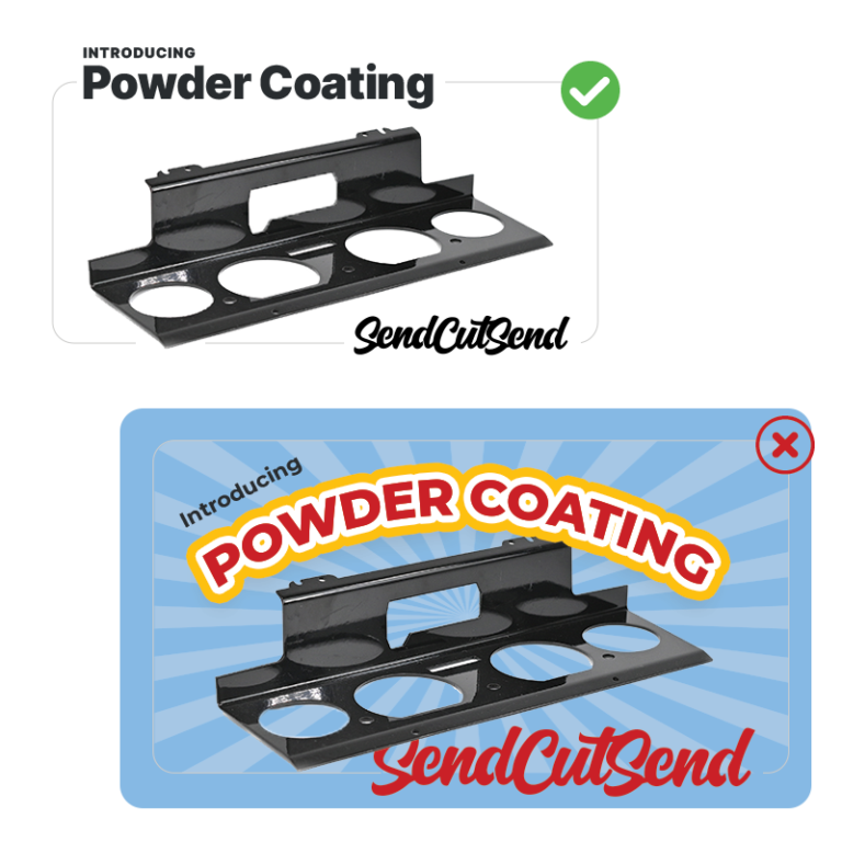
Less is more
Our general philosophy is communicating our voice and message without clutter. Clean, simple, and minimal.
Think fine cuisine. Clean, white plates. The focus is our product and services, not distract with busy elements.
Print design allows for a bit more freedom and variety than web, but the main goal is clean, legible, focus on the product.
Negative space
The use of negative space puts more emphasis on the text and images.
Small sizing
We don’t need to yell with our logos and fonts. Start small. Enlarge only where necessary.
Limited color palette
Using limited colors allows the focus to be on our products. Too many colors can distract.
Minimal font styles
Font styling should be used to convey importance. Our goal is simplicity and consistency.
Logo Usage
When using our logo, we have four basic rules:
Use one of our approved logos, no variations
Use one of our three approved logo colors
Use proportional scaling
Use a healthy dose of negative space.
Approved logos
The logos below can be used in any of our approved colors. The use of the laser gun not accompanied by text is not allowed outside of internal company usage. That means, unless you are an employee of SendCutSend, please always use the laser in conjunction with the text.
Use our logos in the colors below based on the background you will be placing the logo on.
Black #000000: for use on light backgrounds
Red #CB1217/Pantone 485: can be used on light or dark
White #FFFFFF: for use on darker backgrounds
We love all the colors of the rainbow, just not on our logo
Spacing
We like our logo to have plenty of breathing room. A safe rule is to allow at least one “n” around all sides of the logo.
Proportion
We realize not all spaces are horizontal, but please don’t squish our logo to fit. Always scale proportionally and use our vertical logo for taller spaces.
Use our vertical layout logo for taller spaces
Please don't squish or extend our logo
Color Palette
We have a fairly monotone color palette. Please stick to the colors below when designing signs, stationery, and other promotional items.
Primary colors
#000 | Black
#cb1217 | Red Pantone 485
#FFF | White
Secondary/Accent colors
#509be0 | Blue
Pantone 279
#282c2f | Gray Pantone Black 3c
#454d55 | Gray Pantone 7540
#68737d | Gray Pantone 431
#ccc | Gray Pantone Cool gray 3
#f5f5f5 | Light Pantone Cool gray 1
#ffca22 | Yellow Pantone 7848
#7cb555 | green Pantone 360
Color usage
Primarily use primary colors. Easy rule, right? Read below for when and where to use secondary colors.
Mainly used to show links for online design. Can also be used as an accent color for print and web.
Used to show inline links on web. Can be used as an alternate background color for print and web.
Use for body text on print and web. Can be used as an alternate background color for both.
Used for icons and secondary links. Can be used as an accent color for print and web.
Used as a border color for forms and boxes.
Used as an alternate background color to distiguish sections apart from each other.
Used as second alternate background color to distiguish sections apart from each other.
Used only as a warning color, mostly in print.
Used as a "green light" on print and web. Use as a check mark when showing an item is correct.
Design Principals
Now that you have the proper tools, lets talk about how to use them on your first design. We follow four basic rules of design to ensure our message is clear, concise, and matches our brand.
Intuitive
Don’t make a customer have to think when they are viewing or using your design.
Where do they go next? What are the main points of action? Is the intended path clear and easy to follow?
Clean
Put on your white lab coat and think sterile. Our main goal is to showcase parts and services. The less contaminating elements, the more focus our services receive.
Try using more negative space and subtle background colors instead of borders to separate groups of elements.
Keep copy short and sweet. Remove as many words without taking away from the message.
Can you convey hierarchy without adding more color or font sizing?
Clear
Try the squint test. Stand back from your design or screen. Squint your eyes so the details are blurred. What do you see? If you can clearly identify levels of importance and key elements, then your design has passed!
Consistent
Your design should be consistent with our other materials. Humans are creatures of habit. If we usually click a button on the right, that is where we will always look. Refer to previous designs. Where are the key elements placed, what colors were used, how was the message conveyed?
Typography & Fonts
We use one font face for print and web. Please only use this fonts in the weights and sizes specified below.
We often get asked what font we use for our script logo. It is a hand-drawn creation from our leader, Jim. Unfortunately, it is not available in font form.
Web Font
We use Inter Tight for all things web. Why? Because it’s free, works on all browsers, and it’s clean and professional. This font is available for free on Google Fonts.
Mobile Font-size: 13px Color: #454d55 Line-height: 1.5em Font-weight: 400 or bold
Print typography
When designing for print, we rely less on specific rules for sizing and more on four basic rules of thumb. These go hand in hand with our basic design rules.
Limit styles & sizes
We use bold and regular weights and try to limit 3 sizes per page. There are instances where you may need more, but start with less, add only as needed.
Start small
Body copy should never be more than 10-12pt. Use this as a starting point. For less important areas you can go as small as 6pt.
Minimal color usage
Black headlines, dark gray body copy, and pops of color only when needed. On dark backgrounds, please use white text for readability.
Logical heirarchy
Convey important points using large and bold fonts while keeping the rest small and light. Stand back and look at your design. Can you easily identify the main points?
Icon Font
We have our own custom icon font for use on web and print items. If you need an icon we don’t have, you can create your own. Keep styling similar so it looks cohesive.
Before you use an icon, ask yourself the following questions. Icons are fun, but they aren’t always needed. When you use them, take advantage of proper negative space, and keep the basic design rules in mind.
Is it easily recognizable?
Without supporting text, is it obvious what the icon means or represents?
Is it necessary?
Does the icon help a reader or visitor in their path or does it distract? Is the icon a pixel that can be removed to keep the overall design clean?
Does it match the rest of the design?
Does the styling, colors and sizing of the icon flow with the elements around it?
Approved media
The links below will take you to our Dropbox folders for videography.


